Blume
Brand Identity
Introduction - In 2019, Blume, a dynamic floral business, was established in the vibrant city of Brighton. Specialising in online flower sales while also maintaining a physical shop, Blume quickly positioned itself as a leading name in the floral industry. Tasked with developing the brand's visual identity, I embarked on a comprehensive design journey to create a logo, website, packaging, and illustrations that would embody Blume's unique essence.
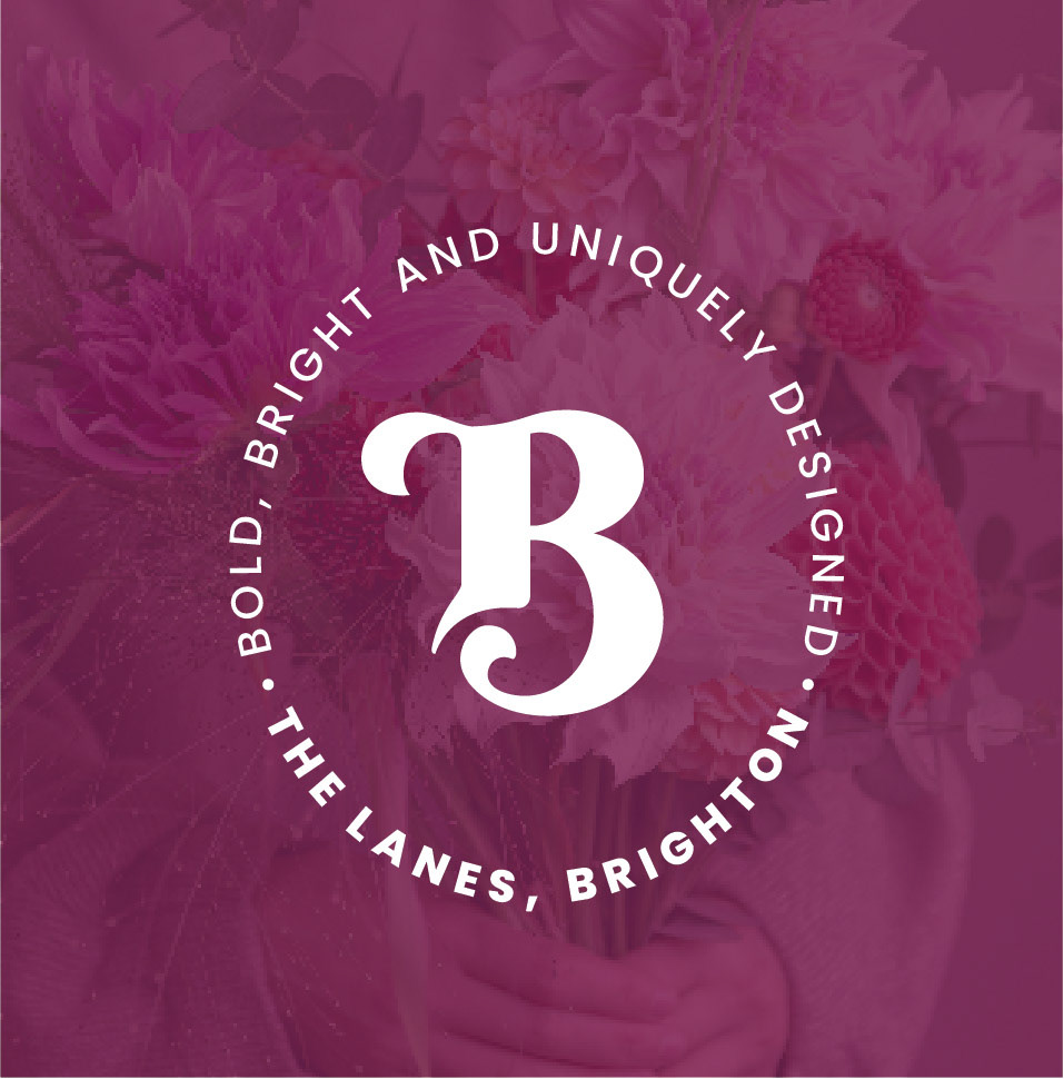
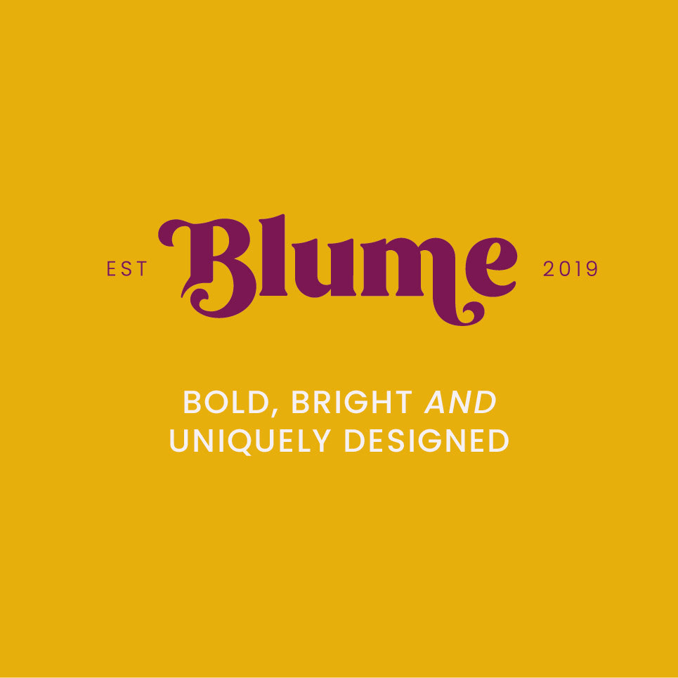
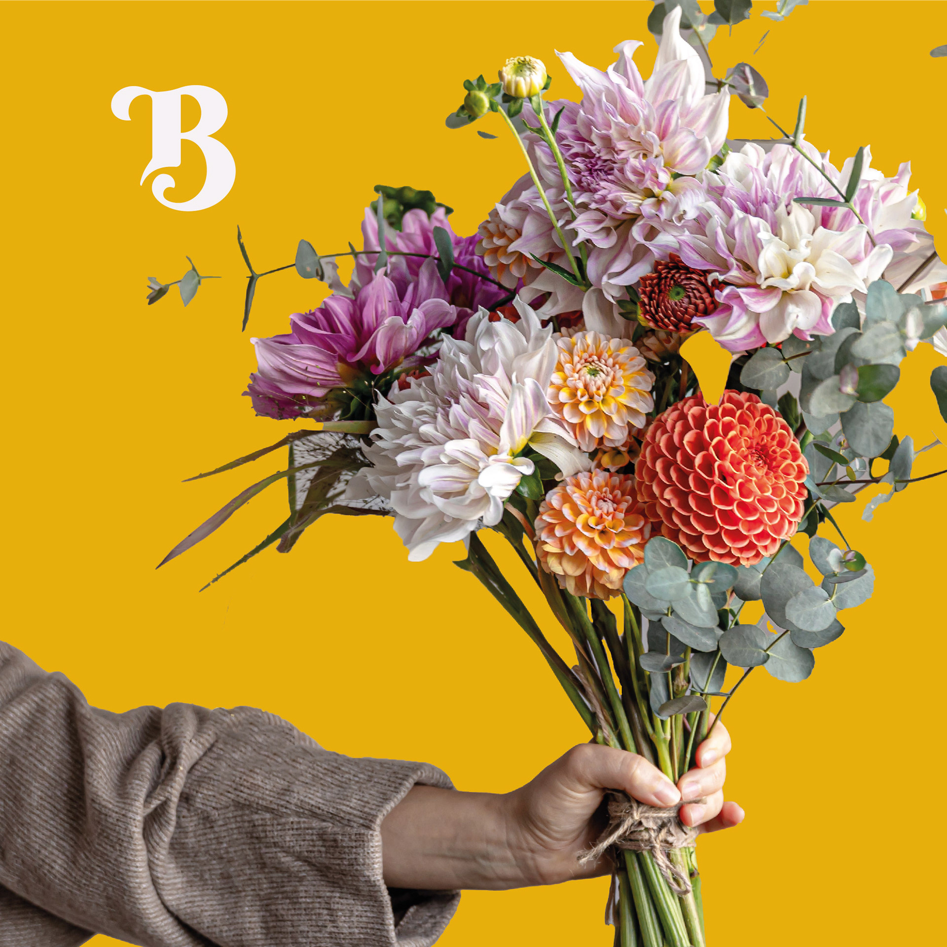
Logo Suite - The logo suite for Blume consists of three distinctive logos, each crafted to convey the brand's core values of being "bold, bright, and uniquely designed." The branding features a harmonious blend of the brand’s signature colours: purple, bold yellow, and green. These colours were chosen for their vibrancy and ability to evoke a sense of freshness and energy. The secondary logos provide versatile options for various applications, ensuring consistency and recognisability across all platforms.
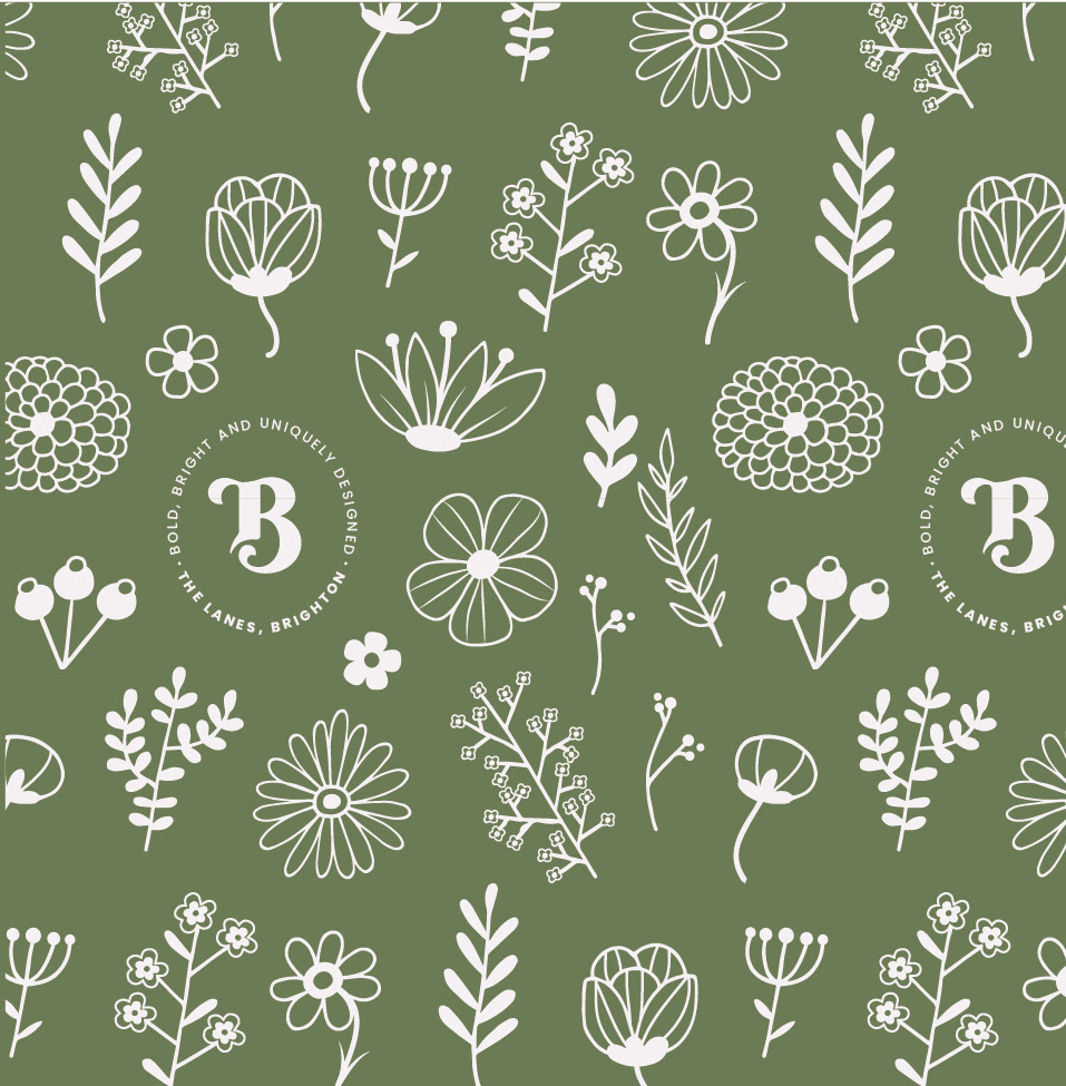
Illustrations - A key element of Blume’s visual identity is the collection of flower illustrations. These illustrations are designed as simple, one-color outlines that are both modern and elegant. The decision to keep the illustrations minimalistic allows for flexibility in their application, making them suitable for various mediums including the website, packaging, and in-store displays. The illustrations serve as a visual thread that ties all brand elements together, reinforcing Blume’s unique design philosophy.
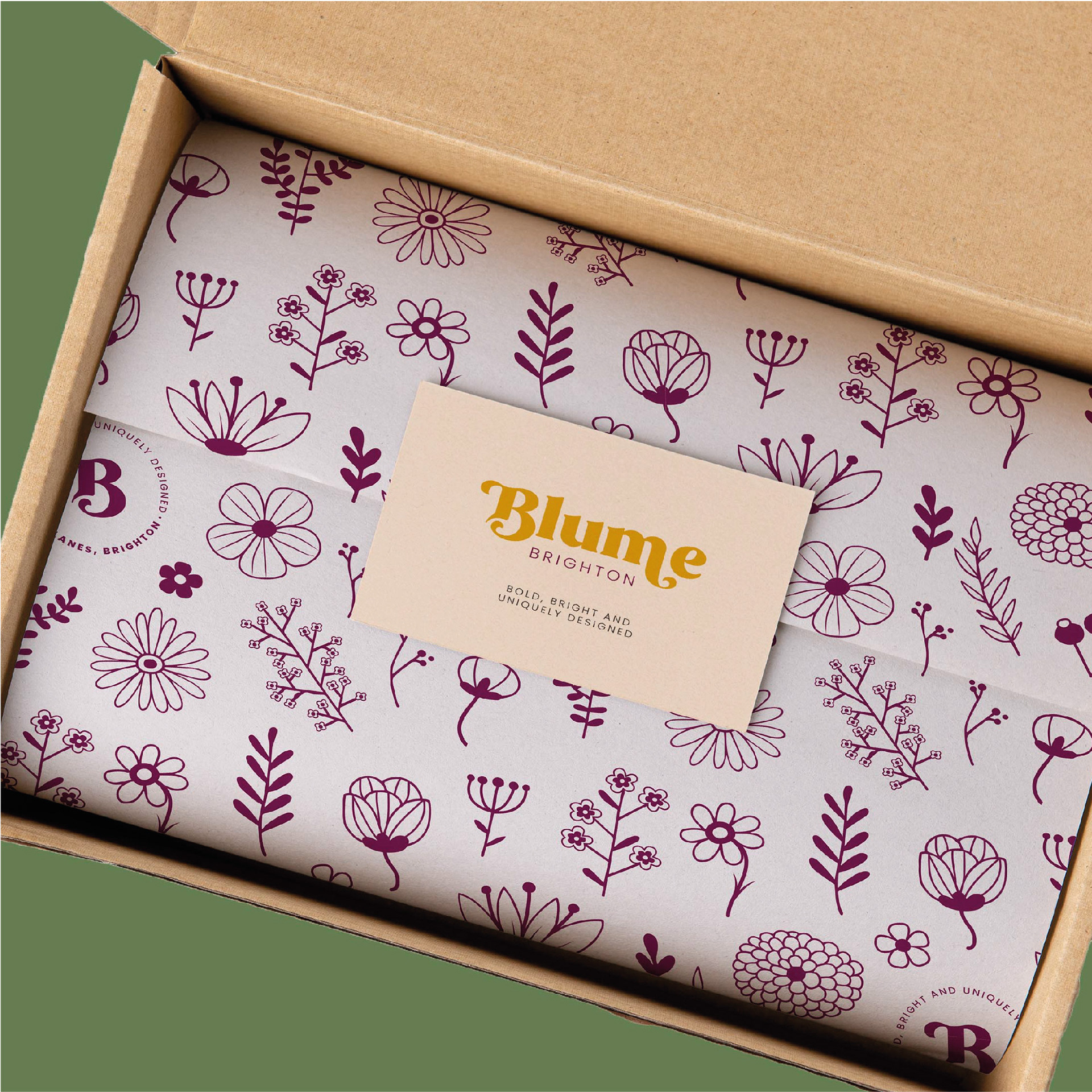
Packaging Design - Blume's packaging was designed to reflect the brand’s commitment to boldness and simplicity. The packaging features the one-colour flower illustrations, maintaining the minimalist yet effective approach. The use of the brand’s bold colours ensures that each package stands out, creating a memorable unboxing experience for customers. The cohesive design across different packaging types – from small gift boxes to large delivery parcels – ensures brand consistency and reinforces Blume's identity.
Website Design - The website for Blume was designed with user experience at the forefront. The goal was to create an intuitive, visually appealing online space where customers could easily browse and purchase flowers. The website design incorporates the brand's colour palette, the accents draw attention to key elements such as the navigation menu, product listings, and call-to-action buttons. The integration of simple, one-colour flower illustrations adds a unique touch, enhancing the overall aesthetic without overwhelming the user.
Conclusion - The branding project for Blume was a comprehensive endeavour that successfully captured the essence of the brand. By leveraging a bold colour palette, creating versatile logos, designing an intuitive website, and incorporating simple yet impactful illustrations, the visual identity of Blume stands out in the floral industry. The cohesive design approach not only reflects the brand’s tagline "bold, bright, and uniquely designed" but also ensures a memorable and engaging experience for Blume’s customers.
